Hi, I'm a student in design. Living, working, loving and playing in Bonn and Cologne, Germany. Open minded and thinking outside the box. And as your creative mate, I am here to empower your customers through better design and creative solutions. Follow me if you are interested in reading about the stuff I'm doing and the things I'm learning. Enjoy your stay and feel free to mail me. Thibault Jan Beyer
Hallo, ich bin design Student. Lebe, Arbeite, Liebe und Spiele in Bonn und Köln, Deutschland. Ich bin ein Querdenker, Freidenker und durchweg aufgeschlossen. Als Dein kreativer Freund, bin ich hier um Dich und Deine Kunden durch besseres Design und kreative Lösungen zu stärken. Folge mir, wenn Dich interessiert was ich mache. Genieße Deinen Aufenthalt hier und fühle Dich eingeladen mir jederzeit zu schreiben. Thibault Jan Beyer
Salut, je suis un étudiant en Design. Je vis, travaille, aime et joue à Bonn et Cologne, Allemagne. Je suis libre-penseur, non-conformiste et une personne très ouverte. En tant que ton amis créatif, je vais t'aider à consolider ton business et celui de tes clients grâce à de meilleur designs et solutions créatives. Suis moi si tu t'intéresse à mes projets. Amuse-toi bien et sens-toi libre de m'envoyer un mail à tout instant. Thibault Jan Beyer
Education:
• Kölner Design Akademie (KDA), Design
• University of Bonn, Philosophy and Theology
• Athenée César Franc (ACF) Belgium, A levels
Languages:
• German - Fluent
• French - Fluent
• English - CAE C1 level
• Latin - Beginner
• Dutch - Beginner
• Hebrew - Beginner
• Ancient Greek - Beginner
Ausbildung:
• Kölner Design Akademie (KDA), Kommunikationsdesign
• UNI Bonn, Philosophie und Theologie
• Athenée César Franc (ACF) Belgien, Abitur
Sprachen:
• Deutsch - Muttersprache
• Französisch - Muttersprache
• Englisch - CAE C1 level
• Latein - Universitätsniveau
• Alt-Hebräisch - Universitätsniveau
• Alt-Grieschich - Universitätsniveau
• Niederländisch - Schulniveau
Éducation:
• Kölner Design Akademie (KDA), Kommunikationsdesign
• Universitée de Bonn, Philosophie et Theologie
• Athenée César Franc (ACF) Belgique, baccalauréat
Langues:
• Allemand - langue maternelle
• Français - langue maternelle
• Englais - CAE C1 level
• Latin - niveau universitaire
• Hebreux ancient - niveau universitaire
• Ancient Grec - niveau universitaire
• Hollandais - niveau scolaire
Work Experience:
• agentur-rubbeldiekatz, Intern
• Subway, supervisor
• Hotti, Advisor of holiday activities
• ndF Der Bergdoktor - Austria, Intern
• Movie Es ist alles in Ordnung, Setrunner
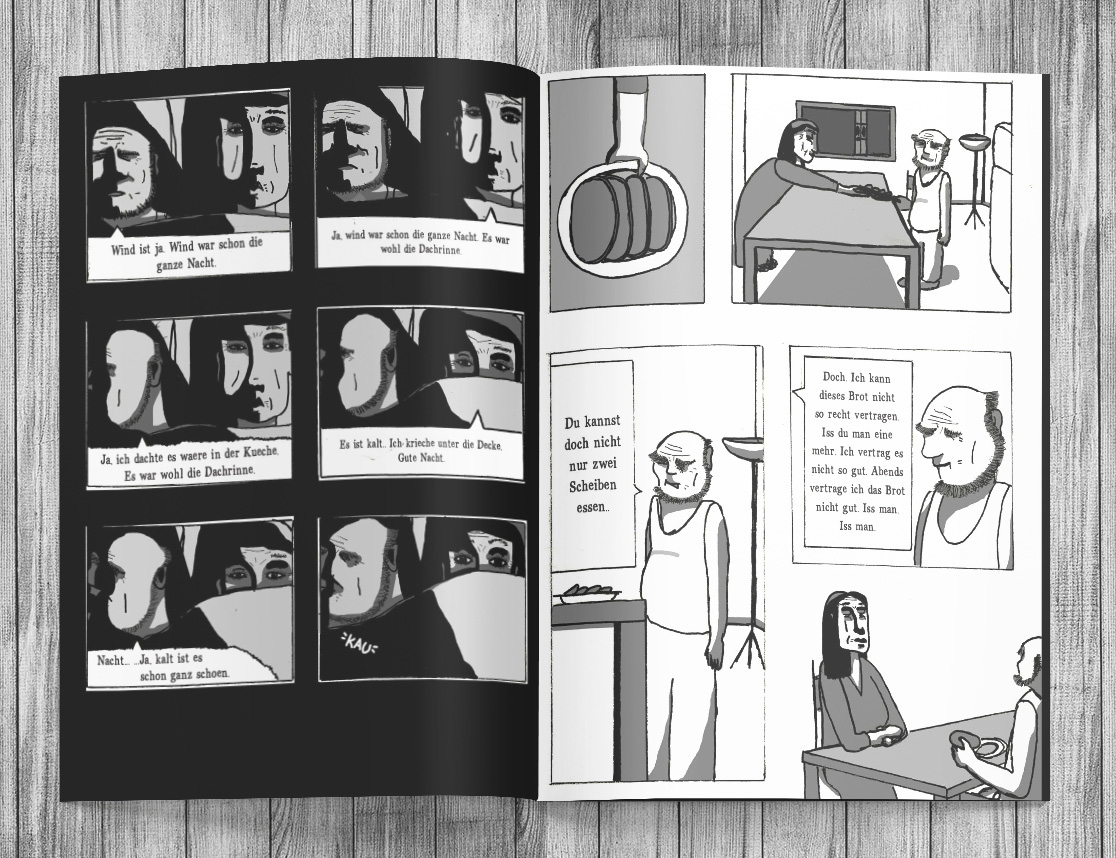
• Movie Hives, assistant unit manager
• Short 21kHz, making of
• Short Aufstrich, making of
• Short Ratten, setrunner
• Short Once upon a time Gypsies, boomer
• International Filmschool Cologne (IFS), Intern
Arbeits Erfahrung:
• agentur-rubbeldiekatz, studentische Aushilfskraft
• Subway, Schichtleiter
• Hotti, Jugend-Betreuer
• ndF Der Bergdoktor - Austria, Praktikant
• Spielfilm Es ist alles in Ordnung, Setrunner
• Spielfilm Hives, Assistent der Set-AL
• Kurzfilm 21kHz, Making Of
• Kurzfilm Aufstrich, Making Of
• Kurzfilm Ratten, Setrunner
• Kurzfilm Once upon a time Gypsies, Ton-Assistent
• Internationale Filmschule Köln (IFS), Praktikant
Expérience Professionelle:
• agentur-rubbeldiekatz, assistant étudiant
• Subway, chef d'équipe
• Hotti, animateur
• ndF Der Bergdoktor - Austria, stagiaire
• Movie Es ist alles in Ordnung, Setrunner
• Movie Hives, assistant unit manager
• Short 21kHz, making of
• Short Aufstrich, making of
• Short Ratten, setrunner
• Short Once upon a time Gypsies, assistant son
• International Filmscool Cologne (IFS), stagiaire
Skills:
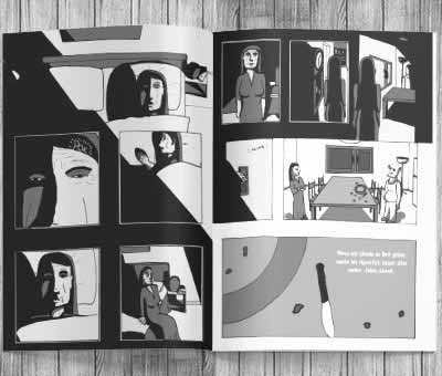
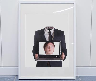
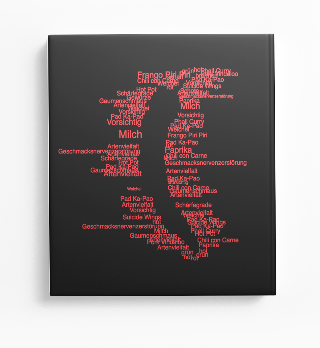
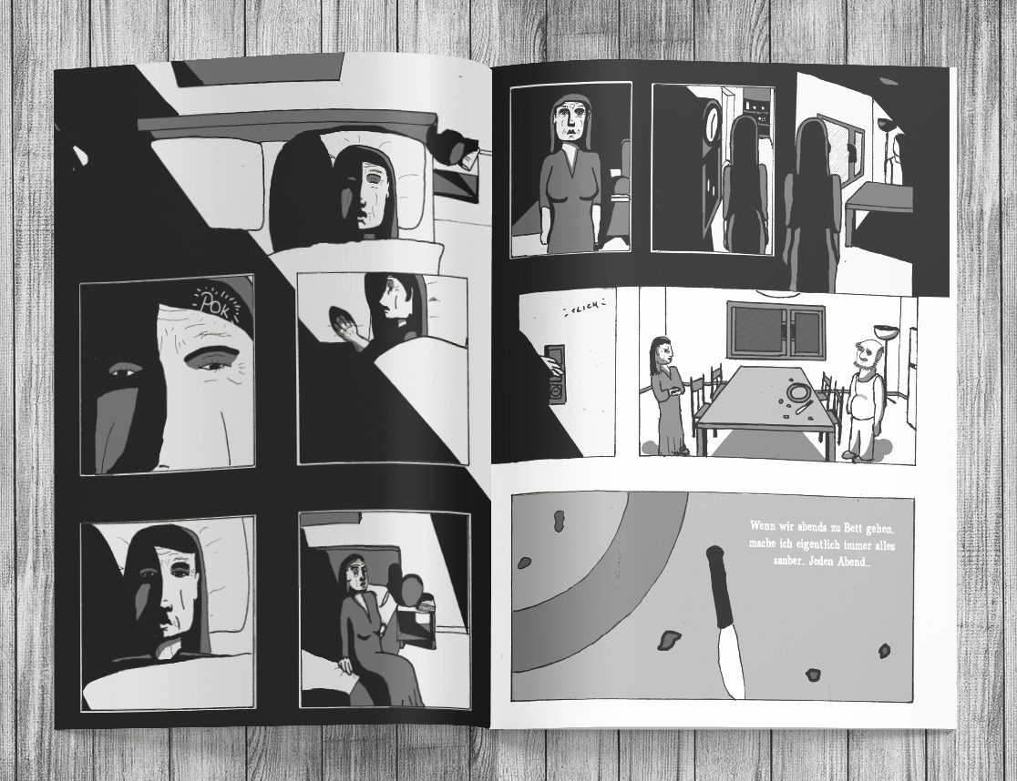
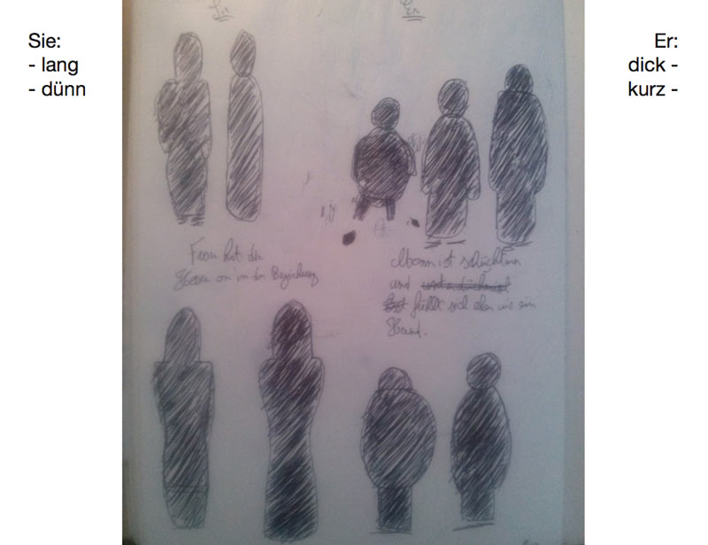
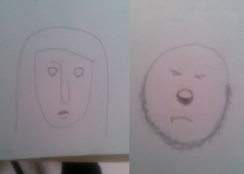
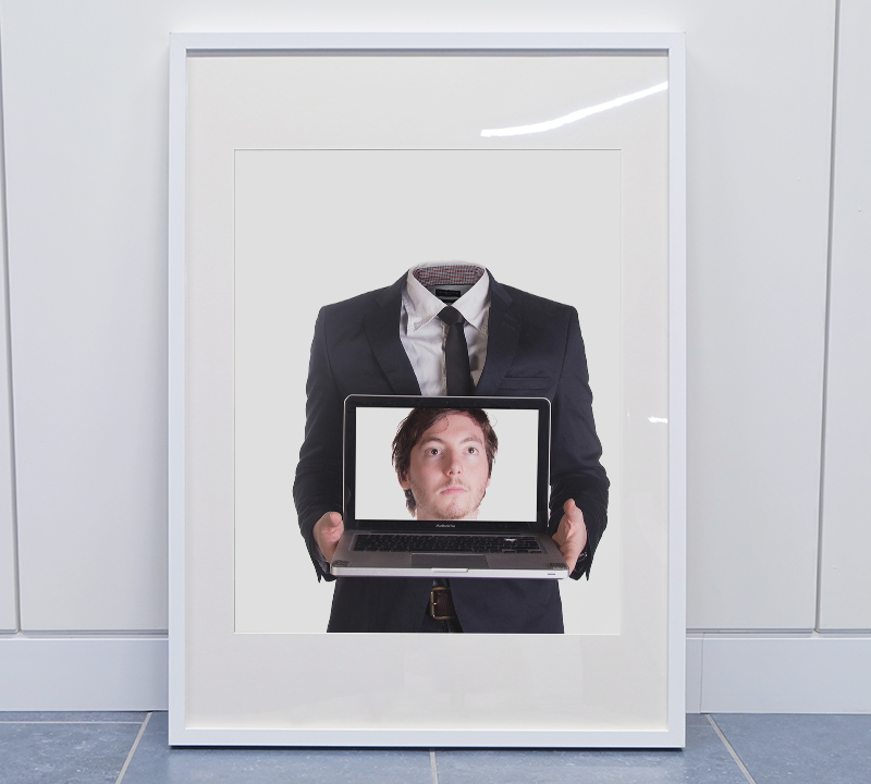
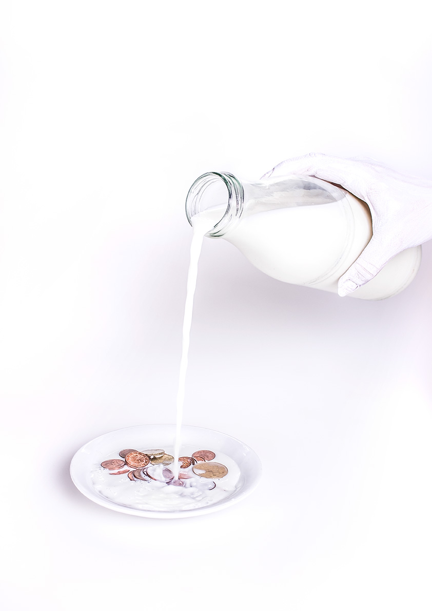
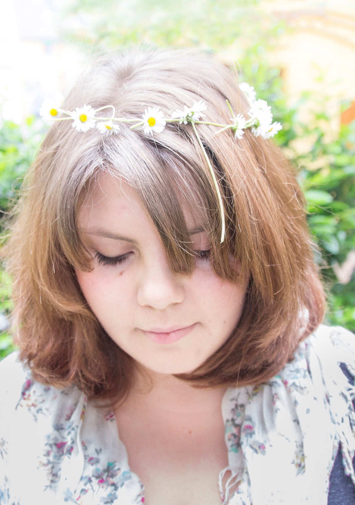
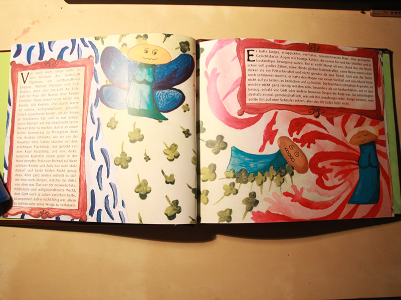
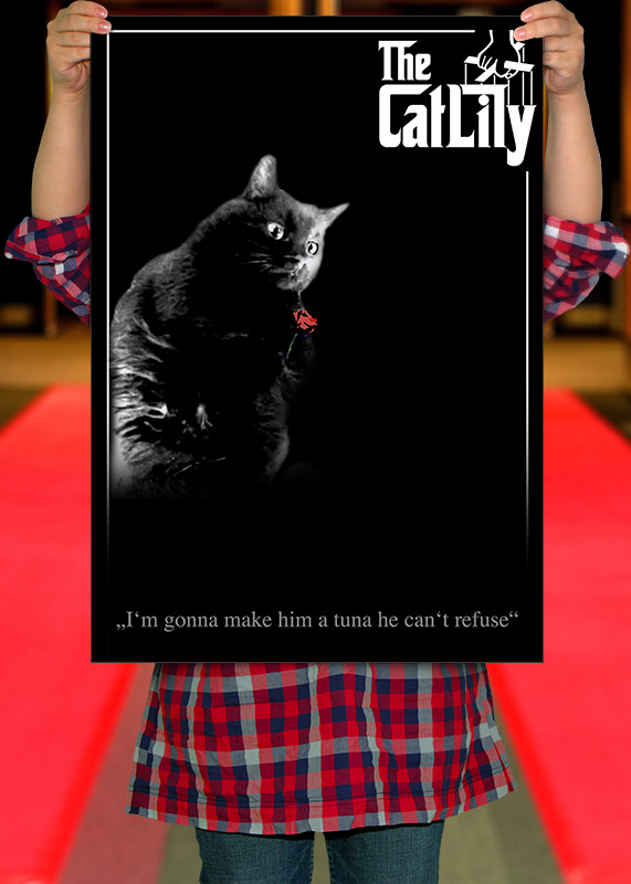
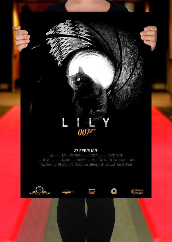
• Creativity
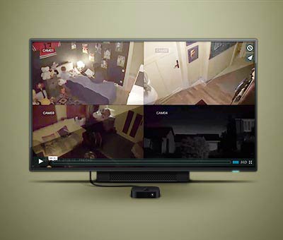
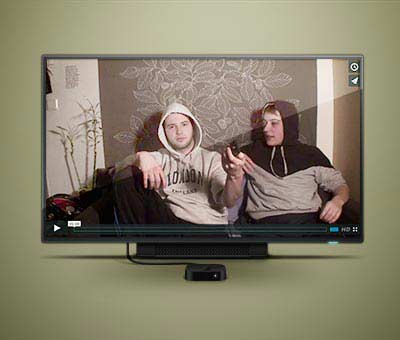
• Video Art
• Photo Art
• HTML
• CSS
• JavaScript
• PHP
• CMS
• Illustrator
• Illustration
• Image Art
• Photoshop
• InDesign
• Premiere Pro
• After Effects
• Driving
• Cooking - Awesome
• Coffee - Nope
Fertigkeiten:
• Kreativität
• Video-Kunst
• Photo-Kunst
• Illustration
• HTML
• CSS
• JavaScript
• PHP
• CMS
• Photoshop
• Illustrator
• InDesign
• Premiere Pro
• After Effects
• Autofahren
• Kochen - Großartig
• Kaffee - Nee
connaissances:
• Créativité
• Art Visuel
• Film et Photographie
• Illustrations
• HTML
• CSS
• JavaScript
• PHP
• CMS
• Photoshop
• Illustrator
• InDesign
• Premiere Pro
• After Effects
• Conduire
• Cuisiner - Super
• Café - non
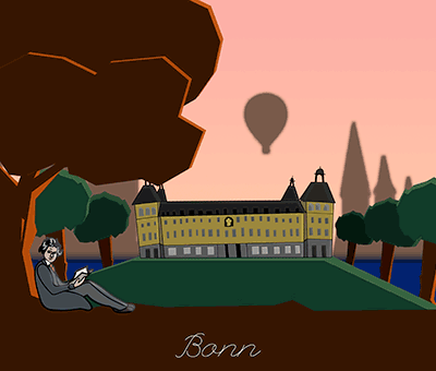
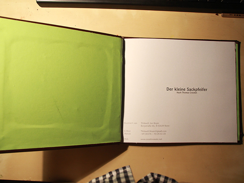
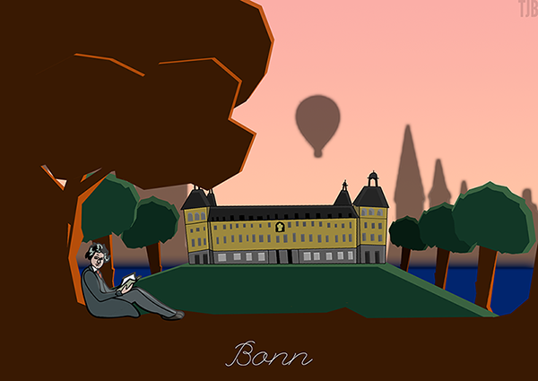
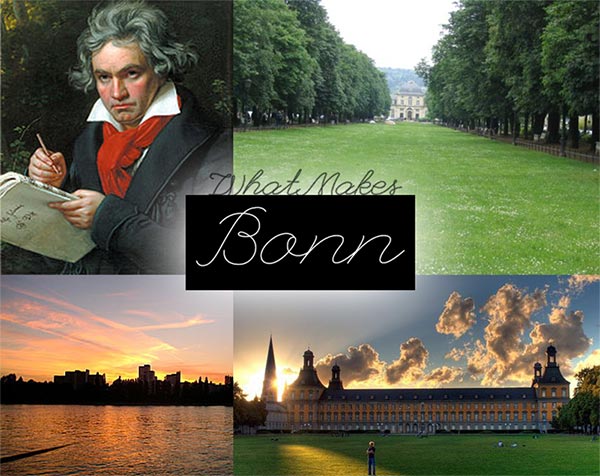
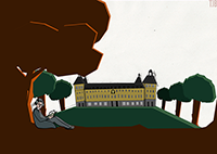
53129 Bonn - This is where you'll find me.